Data Visualization Tools and Techniques: How to Use Them in Business
Data visualization shortcuts time to insight. It is an essential part of a data-led business strategy. But choosing the right data visualization instruments and platforms for the job can be challenging — if you make a wrong call it may lead to misinterpretation, bias, and poor decision-making.
To help you solve this challenge, we gathered top visualization techniques and tools and factors that may impact your choices. We also reviewed the top widely used tools for data visualization and dashboarding in 2025 and added a few expert tips from our CTO on how to pick and combine visualizations to create effective dashboards. We also show how the adoption of these tools can affect business outcomes and give several real-world examples from our experience.
Visualization is the first step to make sense of data. To translate and present complex information and relations in a simple way, analysts use different methods of data visualization — charts, diagrams, maps, etc.
Choosing the right technique and its setup is often the only way to make data understandable. Vice versa, poorly selected tactics won’t let you unlock the full potential of data or even make it irrelevant. These factors impact your choice of techniques for data visualization:

- Audience. It’s important to adjust data representation to the specific target audience. For example, fitness mobile app users who browse through their progress would prefer easy-to-read uncomplicated visualizations on their phones. On the other hand, if insights are intended for researchers, specialists and C-level decision-makers who regularly work with data, you can and often have to go beyond simple charts.
- Content. The type of data you are dealing with will determine the tactics. For example, if it’s time-series metrics, you will use line charts to show the dynamics in many cases. To show the relationship between two elements, scatter plots are often used. In turn, bar charts work well for comparative analysis.
- Context. You can use different data visualization approaches and read insights depending on the context. To emphasize a certain figure, for example, significant profit growth, you can use the shades of one color on the chart and highlight the highest value with the brightest one. On the contrary, to differentiate elements, you can use contrast colors.
- Dynamics. There are various types of data, and each type has a different rate of change. For example, financial results can be measured monthly or yearly, while time series and tracking data are changing constantly. Depending on the rate of change, you may consider dynamic representation (steaming) or static data visualization techniques in data mining.
- Purpose. The goal of data visualization affects the way it is implemented. In order to make a complex analysis, visualizations are compiled into dynamic and controllable dashboards equipped with different tools for visual data analytics (comparison, formatting, filtering, etc.). However, dashboards are not necessary to show a single or occasional insight.
Get the most of your data
Looking for a skillful team to create effective and responsive data visualization and dashboards to deliver important insights for your business?
Hire data teamDepending on these factors, you can choose different data visualization techniques and configure their features. Here are the common types of data visualization techniques:
Charts
The easiest way to show the development of one or several data sets is a chart. Charts vary from bar and line charts that show the relationship between elements over time to pie charts that demonstrate the components or proportions between the elements of one whole.

Image credit: duke.edu
Plots
Plots allow to distribute two or more data sets over a 2D or 3D space to show the relationship between these sets and the parameters on the plot. Plots also vary. Scatter and bubble plots are some of the most widely used visualizations. When it comes to big data, analysts often use more complex box plots to visualize the relationships between large volumes of data.

Image credit: duke.edu
Maps
Maps are popular techniques used for data visualization in different industries. They allow locating elements on relevant objects and areas — geographical maps, building plans, website layouts, etc. Among the most popular map visualizations are heatmaps, dot distribution maps, and cartograms.

Image credit: duke.edu
Diagrams and matrices
Diagrams are usually used to demonstrate complex relationships and links and include various types of data in one visual representation. They can be hierarchical, multidimensional, or tree-like. Matrix is one of the advanced data visualization techniques that help determine the correlation between multiple constantly updating (steaming) data sets.

Image credit: duke.edu
Along with the demand for data visualization and analysis, the tools and solutions in this area develop fast and extensively. Prompt-based interactive analysis, 3D visualizations, immersive experiences and shared VR offices are getting common alongside traditional web and desktop interfaces. Here are three categories of data visualization technologies and tools for different types of users and purposes. Feel free to jump on to the category that best fits your requirements and needs:
No-code easy to learn and use tools for everyone…
Tools for engineers to biuild BI and data-driven applications…
Tools for complex visualizations, analytics, and monitoring…
Tableau is one of the leaders in this field. Startups and global conglomerates like Verizon and Henkel rely on this platform to derive meaning from data and use insights for effective decision making. Apart from a user-friendly interface and a rich library of interactive visualizations, Tableau stands out for its powerful capabilities.
The platform provides diverse integration options with various data storage, management, and infrastructure solutions, including Microsoft SQL Server, Databricks, Google BigQuery, Teradata, Hadoop, and Amazon Web Services. This is a great tool for both occasional data visualizations and professional analytics.
The system can easily handle any type of data, including streaming performance data, and allows to combine visualizations into functional dashboards. Tableau, as part of Salesforce since 2019, invests in AI and augmented analytics and equips customers with tools for advanced analytics and forecasting.

Image credit: Tableau
Also in this category: Among popular all-purpose visualization tools in this category are easy-to-learn Visme and Datawrapper which allow to create engaging visualizations without design and coding skills. Both tools provide free basic plans to start from.
ChartBlocks and AI-powered Infogram are other no-code tools with dozens of templates and customization options across various data visualization methods.
Marketer’s favorite Canva is a popular solution with varied visualization designs and user-friendly editors. If you use Google suite for business, consider also Looker Studio for business intelligence and reporting.
This category of tools includes more sophisticated platforms for presenting insights. They stand out for rich functionality to fully unlock the benefits of data visualization. These tools are often used to add visual data analytics techniques and features to data-driven applications.
FusionCharts is a versatile platform for creating interactive dashboards on web and mobile. It offers rich integration capabilities with support for various frontend and backend frameworks and languages, including Angular, React, Vue, ASP.NET, and PHP.
FusionCharts caters to diverse visualization needs, offering rich customization options, pre-built themes, 100 ready-to-use charts and 2000 maps, and extensive documentation to make developers’ lives easier. This explains the popularity of the platform. Over 800,000 developers and 28,000 organizations such as Dell, Apple, Adobe, and Google, already use this platform.

Image credit: FusionCharts
Sisense is an pro-league data visualization tool with rich analytics capabilities. This cloud-based platform has a drag-and-drop interface, can handle multiple sources, and supports natural language queries. Sisense dashboards are highly customizable. You can personalize the look and feel, add images, text, videos, and links, add filters and drill-down features, and transform static visualizations into interactive storytelling experiences.
The platform has a strong focus on AI and ML to provide actionable insights for users. The platform stands out for its scalability and flexibility. It’s easy to integrate Sisense analytics and visualizations using their flexible developer toolkit and SDKs to either build a new data application or embed dashboards and visualizations into an existing one.

Image credit: Sisense
Also in this category: Plotly is a popular platform mainly focused on developing data apps with Python. It offers rich data visualization tools and techniques and enables integrations with ChatGPT and LLMs to create visualizations using prompts. Plotly’s open-source libraries for Python, R, JavaScript, F#, Julia, and other programming languages help developers create various interactive visualizations, including complex maps, animations, and 3D charts. So if you focus on Python software development services, consider adding Plotly to your toolset.
IBM Cognos Analytics is known for its NLP capabilities. The platform supports conversational data control and provides versatile tools for dashboard building and reporting. The AI assistant uses natural language queries to build stunning visualizations and can even choose optimal analysis techniques based on what insights you need to get.
If MongoDB is a part of your stack, consider also Atlas Charts for your MongoDB data. It seamlessly integrates with the core platform’s tools and offers various features for creating charts and dashboards with prompts or customizable templates and components.
The growing adoption of cloud, AI, and real-time monitoring technologies place a lot of opportunities before companies and organizations. To deal with large volumes of multi-source often unstructured data, businesses search for more complex visualization and analytics solutions. This category includes Microsoft Azure Power BI, ELK stack Kibana, and Grafana.
Power BI is exceptional for its highly intuitive drag-and-drop interface, short learning curve, and large integration capabilities, including Salesforce and MailChimp. Not to mention moderate pricing ($10 per month for a Pro version).
Thanks to Azure services, Power BI became one of the most robust data visualization and analytics tools that can handle nearly any amount and any type of data.
First of all, the platform allows you to create customized reports from different sources and get insights in a couple of clicks.
Secondly, Power BI is powerful and can easily work with streaming real-time data.
Finally, it’s not only fully compatible with Azure and other Microsoft services but also can directly connect to existing apps and drive analytics to custom systems. Watch the introduction to learn more here.

Image credit: Microsoft
Kibana is the part of the ELK Stack that turns data into actionable insights. It’s built on and designed to work with Elasticsearch. This exclusivity, however, does not prevent it from being one of the best data visualization tools for log data. Kibana allows you to explore different types of data visualization techniques — interactive charts, maps, histograms, etc.
Moreover, Kibana goes beyond building standard dashboards for data visualization and analytics. This tool will help you use different data visualization methods and analytics approaches: combine visualizations from multiple sources to find correlations, explore trends, and add machine learning features to reveal hidden relationships between events.
Drag-and-drop Kibana Lens helps you explore visualized data and get quick insights in just a few clicks. And a rich toolkit for developers and APIs come as a cherry on top.

Image credit: Elasticsearch
Grafana — a professional data visualization and analytic tool that supports a wide range of data sources, including AWS, Elasticsearch, and Prometheus. Even though Grafana is more flexible in terms of integrations compared to Kibana, each of the systems works best with its own type of data. In the case of Grafana, it’s metrics. This visualization software is popular for building IoT applications and creating dashboards and monitoring tools for telemetry systems that use different IoT data collection methods.
Grafana allows you to visualize and compile different types of metrics into dynamic dashboards. It has a wide variation of features, plugins, and roles which makes it perfect for complex monitoring and control systems. It is often used for scalable cloud-based systems built with modern web app architectures that require continuous monitoring and DevOps.
Additionally, it enables alerts and notifications based on predefined rules. And finally, Grafana has perks to cut time to insight, such as creating custom filters and making annotations — adding metadata to certain events on a dashboard.
Also in this category: Qlik Sense is a data intelligence platform with unique capabilities and features. It provides highly interactive visualizations and dashboards that enable fast insight discovery. Every time a user clicks on an event or metric, the platform refines the context on the spot to show unique dependencies and correlations. Qlik stands out for lightning-fast calculations and AI technologies in the core analytics functions.
New Relic is a powerful observability platform mainly focused on providing insights into application performance, infrastructure health, and logs. One of favorite DevOps tools, it stands out for pre-built interactive dashboards, interactive charts, and AI-driven anomaly detection to quickly spot issues and optimize performance. New Relic integrates with cloud providers, Kubernetes, and over 700 other tools and frameworks to fit any tech stack or team needs.
These are just the major tools and techniques of data visualization. All the mentioned platforms and services are evolving very fast and introduce new features and capabilities to keep up with the market needs. Especially when it comes to the growing pace of LLM and AI development.
Choosing the right data visualization techniques and tools is the key point to figure out when working with data. However, it is not the only one. Often visualizations are combined into dashboards to provide analysts, management and other users with complete information on a subject.
Dashboards have different functions (show changes in conditions, help track activity and location in real-time, provide remote monitoring and control of a system, etc.) and specifics (dynamic vs. static, historical vs. real-time, KPI/goals dashboards, etc.) that determine their design and features. However, there are several important factors to consider when you create a data dashboard of any type or purpose.
Tip 1. Stay consistent
Consistency is the key to fluency and fast dashboard navigation. It’s important to stick to specific color-coding, fonts, styles, and visualization elements when showing the same metrics across different dashboards.

We use color coding and repeating elements on HR and payroll dashboard to speed up time to insight and improve navigation.
Tip 2. Choose the right visualizations
No visualization is one-size-fits-all, even a line chart. It’s crucial to choose the right visualization technique for each type of data on a dashboard to ensure its usability and avoid confusion or even misinterpretation. Check the examples in this article that support this point.
Tip 3. Personalize experiences
Not only does the audience impact the choice of individual visualizations but also determines how to create a data analysis dashboard. It’s essential to keep the goals of different end-users in mind when deciding which visualizations and insights should be included in a dashboard. After all, important information for one user can be unessential or even meaningless for others.
Example: A health tracking app used by patients and doctors should have two personalized dashboards. The patient’s dashboard can include basic health metrics such as blood pressure, medication intake, activity tracking, while the doctor’s dashboard can combine patient data with EHR notes and other medical information for proactive risk assessment and a more comprehensive picture of the patient’s condition.
")
Custom dashboards on a chronic care management platform are tailored to the unique needs of doctors and patients.
Tip 4. Bring instant value
A dashboard should provide value the moment the user accesses it. However, it does not necessarily mean that all the data should be stuffed into screen one. On the contrary, visualizations should be carefully selected, grouped and aligned on every screen to immediately answer all important questions and suggest ways to further explore the data.
Tip 5. Consider device constraints
Screen size is an important parameter when we are talking about multifunctional dashboards that are supposed to be used on different devices. A dashboard on a small mobile screen should provide no less value than a dashboard on a desktop screen. For this purpose, designers should consider responsiveness and provide tools and features to easily manipulate dashboards on limited smartphone screens — quickly navigate between views, drill data, compile custom reports, etc.
This point is particularly important when creating UX/UI design for IoT apps for they are usually data-heavy.

On a mobile dashboard, we bring forward the most useful actions usually used on the go.
Tip 6. Test you visualizations
Whether you create an automated data visualization dashboard using tools like Grafana or design a custom dashboard for your system, it’s important to test your visualizations on different volumes of data and in different conditions before going live.
In many cases, dashboards are developed based on test data. Once released, dashboards show real data which can be quite different from the test data. As a result, these dashboards do not look and behave as intended. Testing in different conditions helps bridge this gap and avoid inconsistency.
We have worked on a range of data visualization and analytics projects for cleantech, logistics, healthcare, retail and IT companies and successfully integrated custom tracking and analytics solutions into their operations. Here are a few use cases that show different approaches to data visualization and their effect on business outcomes.
Real-time production monitoring helps a printing company handle a 3x traffic increase with a zero downtime
Our long-standing client, one of the leading printing companies in the US, was dealing with a traffic surge challenge every holiday season. They needed an effective monitoring and control solution to avoid website slowdown or performance decrease.
Our dedicated team has been working with the lab’s tech infrastructure for a decade. To address the challenge, we developed a performance tracking and order management tool based on the combination of Elastic Stack solutions.
It collects and analyzes real-time performance data – website traffic, backend load, the quantity and status of submitted orders, printing status and queue. The system then visualizes data for real-time monitoring, registers failed operations and sends alerts to the support team if any problem is spotted.
From the moment this tool was integrated into the lab’s operations, the company could better manage growing traffic and go through intensive seasonal sales without slowdown or lost orders. Since then, we have upgraded the monitoring system and scaled the client’s entire infrastructure to better address the constantly growing load (microservices development services to enhance scalability and resilience, custom .NET development services and migration to modern .NET versions, adoption of cloud and AI, etc.)
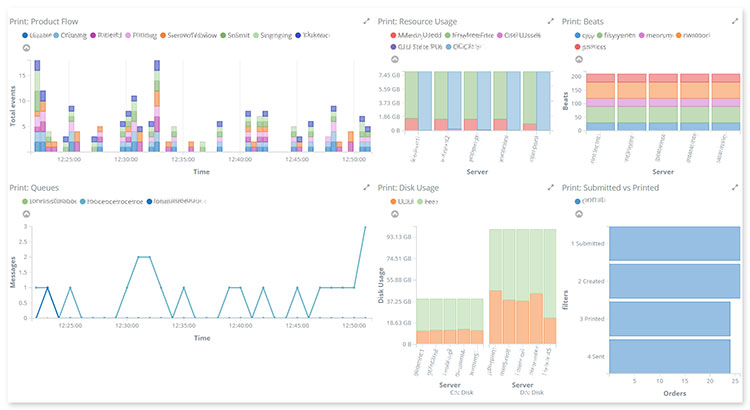
Dashboard for production monitoring and order management
IT infrastructure monitoring helps organizations improve security and employee performance
A Finnish tech company developed a SaaS automating the process of IT infrastructure monitoring and support. The system was originally focused on Windows products, and we were asked to scale it up for the macOS platform. We developed a multifunctional monitoring system to track performance and provide real-time data on the health and security of the customers’ IT infrastructures. The system collects data on registered software and hardware performance, sends it to the cloud-based backend for analysis, and provides customers with visualized insights on dashboards and reports.
When integrated into the company’s operations, the system helps improve employee productivity and mitigate possible security and performance risks. It is an effective tool for IT asset tracking and management. These are a few examples that demonstrate how effective data visualization systems and tools affect business operations and help companies deal with major performance challenges.
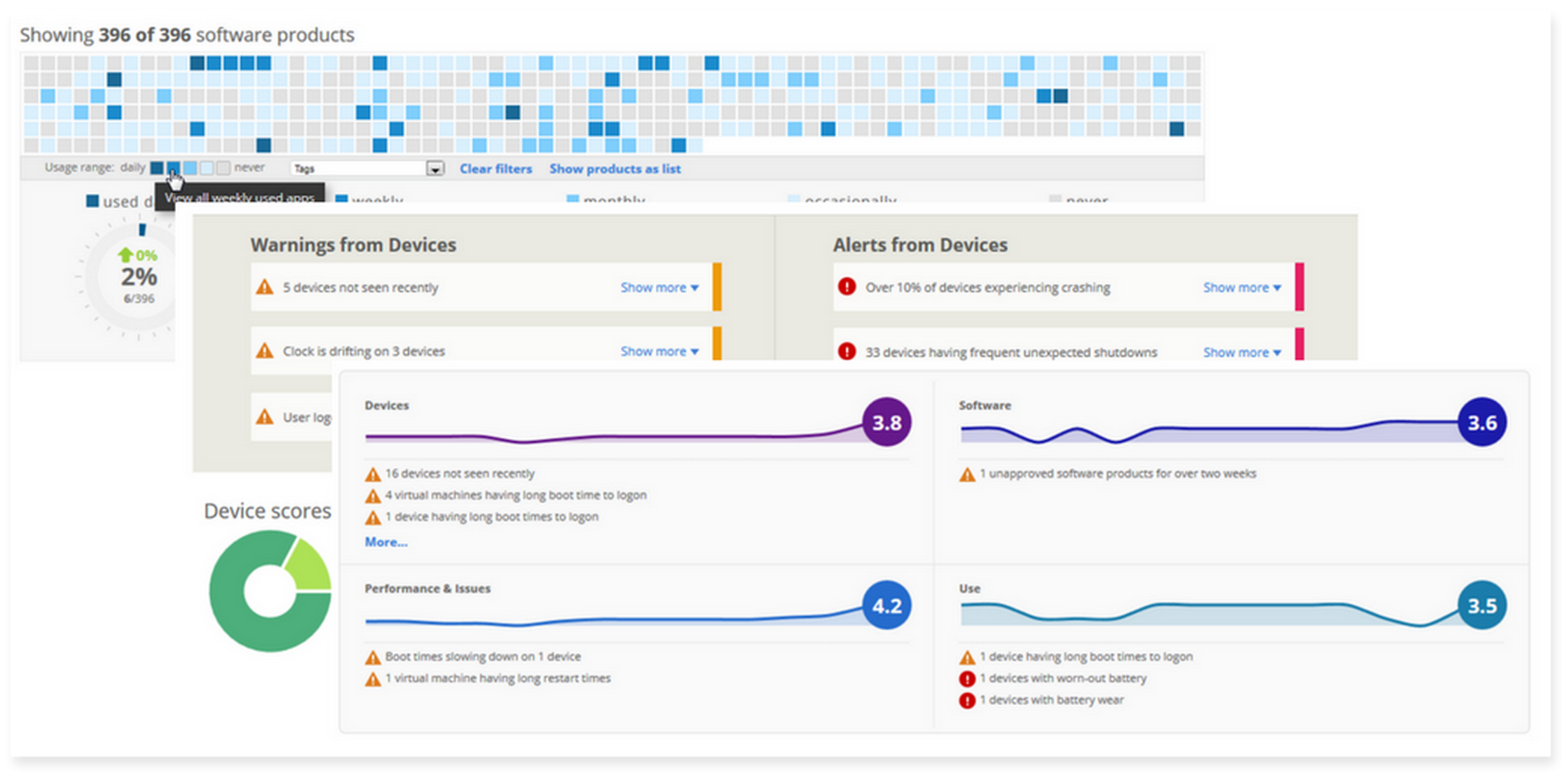
Dashboard for IT infrastructure monitoring
If you are looking for skilled tech experts to help you design and create a data visualization system for your business, consult on the use of professional data visualization tools, and integrate them into your decision-making process, we can help.
We work with a wide range of data visualization and analytics platforms (ELK Stack and Kibana, Grafana, Qlik, Sisense, Power BI, Tableau, etc.) and apply a range of techniques, including popular data visualization techniques in Machine Learning, IoT, and big data. Our designers, software and data engineers create stunning visualizations and data tools for such companies as Oxford Languages, Printique, Origin Digital, feed.fm, and Diaceutics. We can help you:
- Select, configure, and integrate the right data visualization and analytics tools according to your business needs and scale.
- Design and build custom dashboards and add powerful features for data sorting, analysis, and reporting.
- Integrate data visualization techniques in business analytics that best fit your requirements and BI goals.
- Optimize time to insight and cut the cost of BI with robust data management and analytics tools.
- Design, build, and support your entire data infrastructure and operations using modern cloud-based solutions.
- Integrate advanced data processing, management, and analytics tools based on ML/AI in line with compliance and data governance practices.
Check our big data services to learn how we can help you turn your data into a source of income and growth… without losing track of your costs.
Read and understand your data faster
We help you integrate powerful data visualization tools and techniques to your decision-making process.
Hire data expertsWrap-up
We answered the most common questions about platforms, tools and methods of data visualization: What are data visualization techniques and tools? How to use different visualization tools to unlock the power of data? How to build effective data dashboards?
Use this foundational knowledge to start working with your data and select tools that will help you extract real value from your assets. And if you need help finding the right data tools for your specific business needs, contact our team.
This post was originally published on August 10, 2018 and updated on September 16, 2021, September 29, 2023, and March 16, 2025.
FAQ
- Tableau
- Sisense
- FusionCharts
- Power BI
- Kibana
- Grafana
- Create consistent color coding, styles and visualization elements for easy navigation.
- Choose the right visualization techniques for different types of data and use cases.
- Personalize dashboard layout and functionality to specific audience.
- Take into consideration device constraints and provide additional tools to work with insights on small screens.
- Group and align data to maximize value, not volume.
- Test dashboard performance using different volumes of data to see how it can handle the real flows and dynamics.