Improving user experience for Printique*
Hardly would you find a better industry to illustrate how UI/UX perfection influences the number of zeros in the company’s profit stats. For a photo printing B2C company that hooks customers online through excellent user experience focus is not a choice, it’s a must.
Why Printique? As Digiteum we have been working with this photo print genius for 6 years, and not for nothing. One of the leaders of the U.S. market with the quality of printing worthy of Steve McCurry’s attention, Printique can easily boast of calling the shots in the industry. These are true photo-printing pioneers and innovators with million-plus users that stay.
Where to Find a Business Solutions Supplier
Digiteum, in its turn, bears full responsibility for the tech environment Printique online services reside in. In other words, it’s the hands and brains of Digiteum team that create the space and functionality for the photo lab’s online hubs. It implies all user interfaces and user journeys that eventually determine if the customers get what they come for to Printique’s website.
Read: Printique website revamp Case Study
However, it has always been far more than just tech. As a Digiteum co-founder and managing partner, I have a lot to share how the companies have been working alongside. In particular, how Digiteum has been providing Printique with technical solutions that manage business goals and eventually grow into full-scale products and services.
Here’s an example of the solution that solves a real business challenge improving user experience.
Today Printique applies proto print order workflow anew: its Photo Prints Wizard helps the company retain customers at the most slippery step: photo upload. This is how:
Digiteum team has noticed that the time to upload pictures for printing is a bummer that makes customers slip before they order. It’s no wonder it takes time and patience to wait for 200 high-resolution pictures to get in.
So we thought: “what if we pull action forward to processing?” In other words, we let customers add, crop and order pictures before the upload is complete, showing them thumbnails instead of full-size images shortly after the upload is on.
This alternative workflow appeared a business solution that made customers order more and faster even though the processing time hasn’t changed significantly. In this case, we applied a UX-focused approach to solve the business challenge that used to make Printique lose customers.
B2C Success Depends on UX/UI
If a B2C is not customer-centric, then probably one is doing it wrong. Today, for a business to be customer-oriented means to invest into user experience perfection and make it an unbeatable competitive advantage.
If a B2C occupies the photo industry, the importance of UX and UI perfection multiples, since the services in this industry sell by the looks and compete by usability.
On the other hand, sharpening user interfaces and perfecting customer experience greatly depend on the components that shape B2C: business and customers.
Prepare to Deal with
Hi-tech infused industry
Photography is possibly one of the most tech-infused industries considering the volume of available and developing technologies, novelties, facilities and resources, as well as investments and opportunities for the future. To hold a business above water in this field means to keep it up with the tech pace, always.
When it comes to the photo industry, the volume of printing options has amplified to the level when it’s hard to find a material you can’t print on or with today. Think of 3D printing alone.
As a trend tracker, Digiteum has always been in tune with the rhythm and provided partners with tech foundation for opportunity-based solutions. This is how Printique kickstarted metal printing as a pioneer years ago. By now this service has grown into some of the most profitable print products sold online.

However, the technology itself is not the only point that makes photo printing so tight. Consider all the companies engaged, and you will find out that apart from field-focused businesses, the club is full of giants, such as Apple and Google, that somehow deal with and invest in photography. Then, consider the budgets and most importantly, the talents involved in this race, and you will realize how strained the competition is.
Tech-savvy customers
Even if we put aside high availability of semi-pro cameras, quality photo equipment, software and education in the field, we get a confident tech-savvy user with expectations, time constraint and freedom of choice.
What does it mean for a photo print business or any B2C company? Generally speaking, it implies constant efforts to win its customers’ attention. Another issue is the How.
And here come UI and UX, again. Because basically UI is the looks that customers judge by, and UX is the impression left from any sort of interaction with a business, be it browsing through the website or making an online order.
Case Study: UI/UX design for SaaS platform
This is why improving the user interface and customer experience may become the core of business growth, or probably, survival. Here is an example:
Printique has always been eager to control user experience results. Digiteum, on its turn, monitors the performance of every feature based on ongoing analysis and expertise in the field.
Once Printique performed real-time usability tests and focus groups, Digiteum made the analysis of the results. Narrowing down to individual customer experience, it appeared that one pro-photographer, who had a first-time try of the website, dropped out from the landing noting that the picture on the home page is “enthusiast-grade.”
The conclusion was strict: the website is not tailored to the needs of professional photographers. In other words, the UI for this segment of target audience failed and didn’t even let the UX strike. For the records, photo enthusiasts, on the contrary, reacted to the picture positively.
It’s hard to underestimate UI and UX influence on the revenue, isn’t it?
How We Do It
Use terabytes of data
The best thing about being a technical partner of Printique is the ability to access the terabytes of data collected daily. This massive storage contains valuable bits of information on who the online users are and how they explore the website and services, behave, and act online.
Read: How to leverage data for UX
Combining Google Analytics statistics and profound analysis of our database, we can explain what users find intuitive, if and how easily they get what they come for (and what the company needs them to get), and of course, where the website fails or misperforms.
This data is probably some of the most valuable feedback we can get, since we can turn it into the information asset for further UI/UX perfection. However, this is just a part.
Make profound analysis
With the talents that Digiteum has, we are able to perform complex analyses up to par, starting from high-level digital assessment to sound and profound business growth strategy evaluation. When it comes to collaboration with Printique, the second dominates.
As a long-term partner of the photo lab, we can model how even a minor UI upgrade or user journey add-on may influence not only the website but also business performance. Here is a prominent example that explains how analysis works in practice:
Printique has introduced photobook printing as early as in 2009, and since then the service has stayed profitable. However, the analysis performed by Digiteum in 2016 proved that the potential of this product is far higher. So we started to dig.
Digiteum team has performed a complex analysis on the trends, competition, performance and user experience to find out that a part of photobook service users drop out at the stage of book creation for a simple reason: lack of time. Considering the volume of efforts and upload time, the classic process that can be split into 4 steps (upload, choose template, arrange and edit, order to print), even simplified with a range of templates, may not suit the habits of many, who experience the lack of time or patience and leave without a thing.
We continued to dig deeper and studied Printique competitors that provide similar services. Along we went through the trends in the field and audience expectations from online services in general. Surprised, we ended up with the majority of competitors providing at least some express half-automated services of photobook creation. However, none invented a fully-automated one. And that was the moment when we saw the opportunity.
We offered Printique to provide their customers with an alternative workflow based on a smart photobook autobuilder. In other words, we suggested alternative customer journey opportunity that would perfect the existing UX that lacks fast and simple book creator. This is how Auto Build option for PhotoBook Wizard was born.
To introduce a new option, Printique provides customers with a video tutorial on how autobuild option for PhotoBook Wizard works.
Visualize et empera
As if on cue, I am myself a UX evangelist and design devotee, so our HB pencils are always sharpened when the time comes to build ideas for UI improvement and UX perfection. Literally.
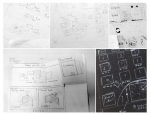
In order to visualize our ideas and projects we may apply whatever means possible. Some of the scketches are made on meeting boards, others go to notebooks.
Scketches and drawings with ideas for Printique
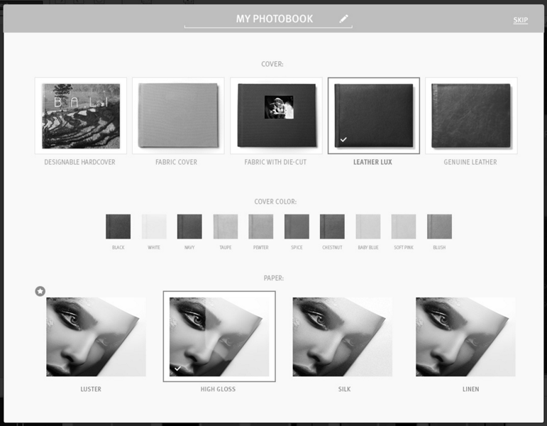
Some drafts and drawings may never leave the paper format, while others transfer to wireframes, and later to design projects and full-scale user interfaces.
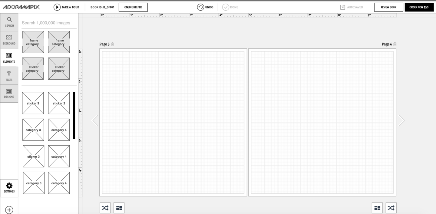
High resolution wireframes for Printique projects
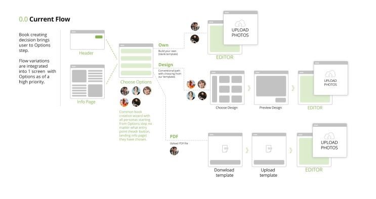
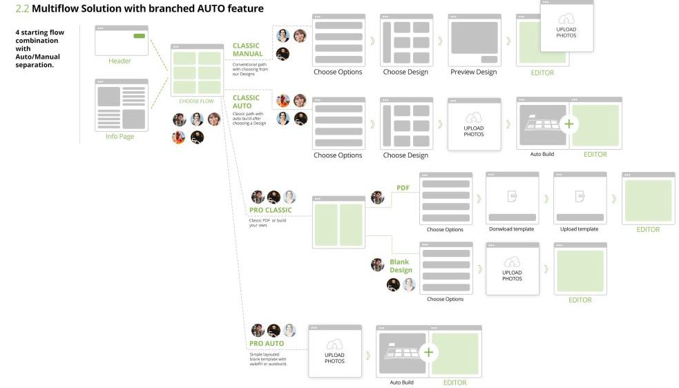
When we came up with the ideas for alternative workflows and photobook autobuild tool, we visualized each user journey through the pathway of steps and determined opportunities for targeted audience. As a result, we could provide our partner [Printique] with descipherable mindmaps for every possible user journey and illustrated how improved user experiences emerge.
Turning ideas into projects is one thing. Perfecting the issued projects is a totally different process, that involves tech and tools, as well as talents to single out what else to make better.
Case Study: Corporate website development
Post-production
You never get a second chance to make a first impression, the CEO of Printique notes from time to time. At Digiteum we put pixel-perfect design concept forward and keep this goal standing out in every project we work on, be it visual design, engineering or a full-scale business solution.
To the point, even though user interface as a visual part of UI/UX duo can be more or less sharpen before the production stage, the results of user experience can be received only when the “users start experiencing.”
Post production stage is crucial, because this is the time when we reap the results. Together with traditional QA, A/B testing, Google Analytics research, and database study we perform the analysis of the results provided by Printique with real-time usability tests and focus groups. And this is where the fun begins.
We have already mentioned the example with the landing rejected by a pro. However, not all user journeys fail because of one personal opinion.
One of the usability tests performed by Printique on PhotoBook Wizard revealed a real customer experience bummer when a user found out that he can’t drag and drop more than one picture for upload. It’s curious, but this uncovered bug turned the overall service impression to minus and illustrated how a single feature may make customers drop out.
Relying on the results great modifications and investments may follow. Yet all post-production UI/UX efforts make sense, since in the end they focus on unlocking the opportunities, and hopefully, greater revenues.
Read: Working from home technology
UX/UI Perfection Unlocks Opportunities
I. Investing into improving user experience will be at least future-oriented, if not more profitable, as it appeared for Printique and Digiteum. Yet, it’s important to start off with the UX and UI perfection in the right place at the right time.
If you are a B2C company, you probably anticipate Black Friday and Christmas craziness every year. For Printique servers that process zillions of uploads simultaneously the pressure of the Black Friday in 2015 resulted with a short-term tragedy: the servers temporarily outaged under the press of high load.
In order to be fully-prepared for this year, Digiteum has been working on the operation optimization and user journey diversification so that not to let the same issue arise. In this case, we focused on user experience not to make is better, but to make it happen.
In other words, to make the investment into UX reasonable and eventually, more profitable, it’s important to fix the parts that are in primary use. Then the results won’t be late, so as the profits.
Read: Oxford Dictionaries API Case Study
II. Another valuable piece of advice is to draw attention to the outside and be agile in a fast-changing environment.
In case of Printique, timely integration with social media and availability of the upload from various platforms were essential. Today people store their pictures across different platforms (Google Photos, DropBox, Facebook, etc.) and want to be able to access them anywhere, anytime. In case of a photo print lab, a simple add-on not only improves user experience, but opens new channels of communication with customers.
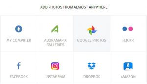
III. The last but not the least advice would be to always look up at the customers and put their needs forward, sometimes even far forward to business goals. Surprisingly, it may first require costs, but later bring double revenue results.
The reason why Digiteum offered and then developed an auto builder for a PhotoBook Wizard was to create the channel to engage more customers and increase user journey opportunities. In this particular case we decided to enable users to go through the online experiences that they feel uncomfortable with, but create workflows that fully comply with their needs and eventually provide them with successful customer journeys.
The examples of improved user experience achieved by Digiteum and Printique celebrated together are endless. One thing is evident: since the time the companies started to collaborate the lab increased its online revenues in times and engaged more than a million of online users in the climate of fierce competition, fast-changing tech environment and decrease of paper printing in general. Enough said to prove how UI/UX perfection may influence profit.
Learn about Digiteum web design and development services and contact our team to start your project.
*Formerly AdoramaPix


